If you prowl around this blog very long you'll run into a bunch of charts. I've experimented with several cloud services for storing data and shown examples of my own data using their charting provisions. All of them are cool, but some of them leave a little bit to be desired. For example, Xively uses Rickshaw <link>, and it's a nice package, but the Xively implementation is too darn complex for my taste. If you look at the various cloud providers, they all have their favorites.
Up until now I've been using the Google graph API for my own stuff, but the problem is that Google Graph uses Flash. Cell phones don't like Flash very much. That means my home graphs don't work on my phone. I absolutely can't let that continue any longer, and since my favorite cloud provider, Grovestreams <link>, uses HighCharts <link>, I stole their example and developed my own graph using the same library.
Hey, they stole my idea for the SteelSeries gauges, turn about is only fair play.
But, as usual, it was an exercise in patience. The documentation on HighCharts is voluminous; it goes on forever and ever with tons of examples and links into JFiddle <link> so the ideas and stuff can be experimented with; talk about information overload. It's also tough to figure out how the set the various properties in the right place to get things done, and none of the examples did exactly what I needed. That's why patience was required. I didn't want to get disgusted with it and just give up.
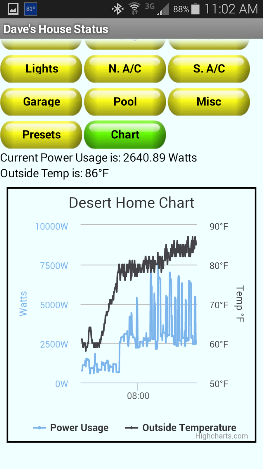
Here's the chart I came up with for my phone:
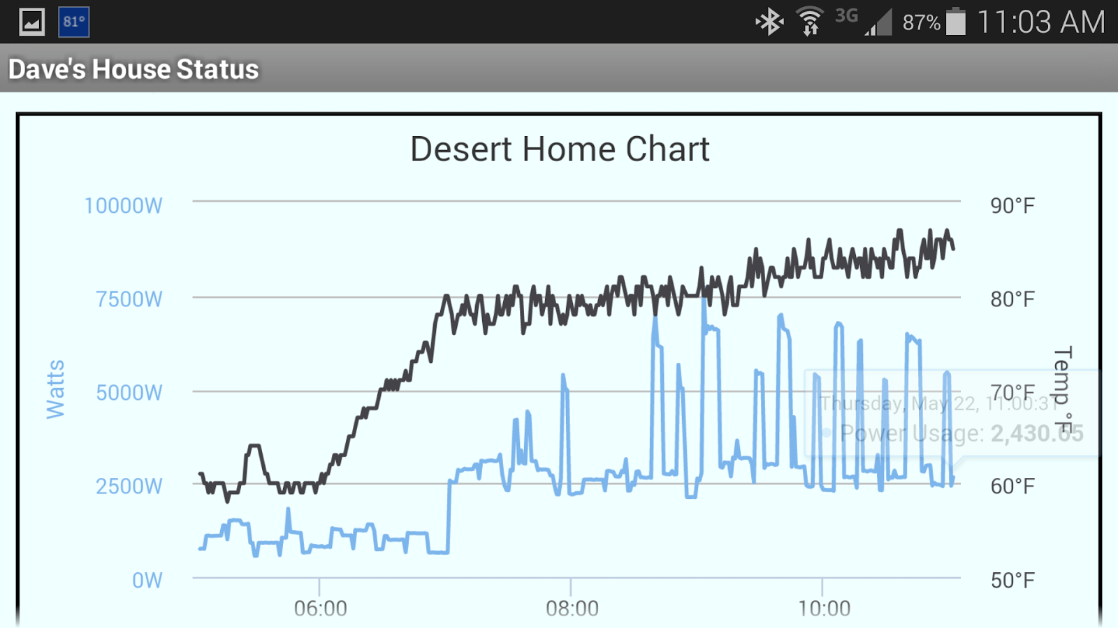
This is actually pretty nice. If you put your pointer inside the chart, you can get the actual reading of any point. If you click, drag across the chart, you can zoom in and see it closer. If you have a touch screen, you can use the 'pinch' and 'expand' to zoom in and out; when your zoomed in, you can slide the chart right and left to see the data. By clicking on the labels at the bottom, you can turn off one of the series to make the remaining one more clear. I could put up a lot of things to examine and choose which one by turning the others off. I'm not sure I like the colors yet, but they're easy to change.
The beauty of this chart is that it's totally javascript. That means it works on the phone, so I can add it to the Android app I have:
OK, the chart looks silly. But look what happens when you turn the phone into portrait mode:
Is that slick or what? Using the touchscreen I can zoom around it and select points to my hearts content.
The data shown is taken from my legacy feed on Xively and was reasonably easy to grab. The only real problems I had getting it going was prowling through the documentation on HighCharts; it was all there, but like finding a needle in a haystack.
If you want to steal my example and modify it for your own use, the first chart on this page is live, so just right click in the chart and 'view frame source'. Doing it that way will get the very latest changes I might have made. However, my ISP has expired my IP lease three times today already, so you may notice a problem while the DNS servers get updated. I may have to look into a static IP address soon since they have been doing this more and more recently.

