I'm going to talk about the APS (Arizona Public Service) phone software for monitoring your power. For folk that don't live here (Arizona, USA), much of this will be of little value. It might give you a clue as to how your own power company works, but this is directed at my neighbors.
I'm not going to describe how to look at your bill, or make a payment, etc. I want to talk about the usage numbers and graphs they provide so you can monitor how good or bad you're doing at saving money by juggling power usage.
First though, I want to explain a bit for people in other countries with different rules around providing power. The name, Arizona Public Service is historic and not actually reflective of what it is. APS is a private company that supplies power to a big part of Arizona. They are publicly held (as in stockholders) and regulated under Arizona's version of a public utilities commission, the Arizona Corporate Commission (AZCC). The AZCC is also in charge of licensing corporations in this state. So, if APS wants to increase its rates to customers, it has to get approval from the AZCC. Confused yet?
One of the things that is part of every submission for a rate increase is the statement, "fair and reasonable return on investment." Which means that if APS runs their business sloppily and doesn't make enough profit, they ask for a rate increase to increase the profit. Nice business to be in. If you screw up a business decision, there's someone out there that will guarantee you a profit.
No, I'm not being completely fair, there are various government requirements that APS is forced to meet, and those do increase their costs. But, every time one of those comes along, a new 'fee' is added to our bill. AZCC approval of these items is almost automatic.
Enough background, on to the actual application.
The app is called 'APS' and is on the google play store for download. Once you get it installed, you can log in to your web account with APS and look at billing and usage. There's also hints on ways to save, but that's just the usual things that we see every day about conservation. The last choice is 'apsFYI' that is the same things that they send with the bills. I'm not going to discuss the billing areas; it's hard to remove my account information from every single illustration. I may get to that at a later point though.
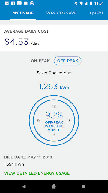
Lets go to 'MY USAGE' and see what it shows for me when I do it, that's where the fun stuff is:
You get a nice display that shows your percentage of use on peak. That means of the amount of energy you used so far this billing period, some percentage was during the peak demand period. Mine was 7%, which must mean that the rest, 93% was off peak usage:
And they have a display for that as well. The real data that can actually help is found by touching the 'Detailed Energy Usage' link at the bottom.
This is actually a nice chart that shows my energy usage for the last 6 days. It's only been six days so far this period. The bars are divided into peak usage, green and off peak usage, blue. The height of the entire bar is my total usage for that particular day. So, I used a lot off peak and only a little bit on peak; the actual values for these can be displayed by touching one of the bars.
So, what does this mean? It shows you when you are using the most power, on peak or off peak, and that's important because the billing rates are considerably different. I want to use as little as possible on peak and concentrate my usage to the off peak periods. That way I can use the larger appliances and pay the least possible for it.
If you touch 'LAST CYCLE' you'll be shown the entire period and you can inspect each day to see if you ran something big during the peak period.
This display can be scrolled left and right to get to a particular day. You can then see the days where you used the most power and work out a plan to deal with it in some fashion. Notice that I used almost 80Kwh on the 28th; it was Saturday and off peak, so I just let the AC run. Rates are much cheaper off peak and I can afford to do this. You certainly wouldn't want the green area to get large because that would result in probably an excess of $100 addition to the bill.
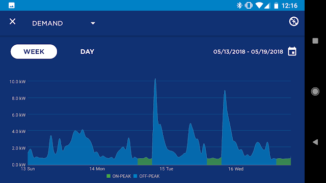
Up at the top of the display is a drop down menu currently labeled 'Daily Energy Use', This menu will let you look at a more detailed display that will actually show you your usage times. Here's mine:
For the last week this displays my usage on a time line so I can get an idea when my major usage occurs. My chart above shows that I cut the usage way back during the peak period (green) and then let it run wild the rest of the time. The big peaks just after the demand period is the AC kicking on full bore to cool the house back down to where I normally keep it. Also in there is the stove, dryer, pool pump, all the things that use a lot of power. See how I control my usage to only the cheaper times?
The reason they call this 'Demand' is because you can scan the green area to see when something turned on a drove the demand number up. They save the highest of the green parts as your demand number and use it as a multiplier on your bill.
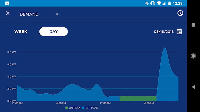
If you choose 'Day' up near the top, you can get one days usage and a good indication of the time of day that you used a lot of power.
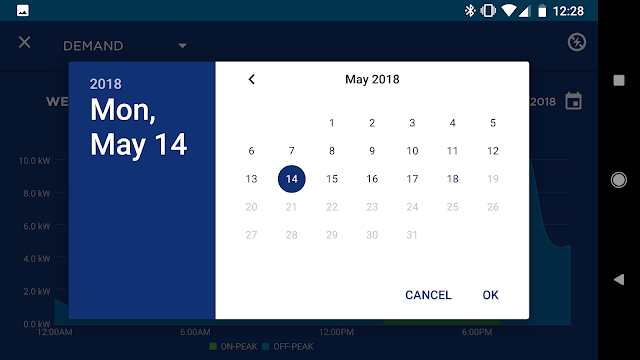
My big power usage spike came after the peak period (green), so I paid the lowest price for it. Notice how I keep the green area (peak usage) as low as possible? That keeps my demand number down to save money. You can get to a specific day by using the little calendar symbol on the upper right.
Doing this will allow you to zero in on some usage period that may be giving you trouble. Fridays after work when you're hot and kick the AC on too early, or the day the kids were home and fooling with the thermostat come to mind. Little things like that can mess up the demand number and cause an unexpected large bill.
That's pretty much the guided tour of the APS app. It can tell you how well you did at controlling usage and help isolate troublesome events. What it doesn't tell you is how you are doing right now. You can't get the current day, or a close to real-time display to tell you something is on that shouldn't be. You can only look back.
My contention is that this nice display was designed to help the APS representative prove it was your fault you get a large unexpected bill. However, given enough time, you can use it to learn what hurts and what you can get away with; you just have to pay for the mistakes when they happen.
Previous post on this subject <link> Next post on this subject <there isn't one yet>


